Design Notes:
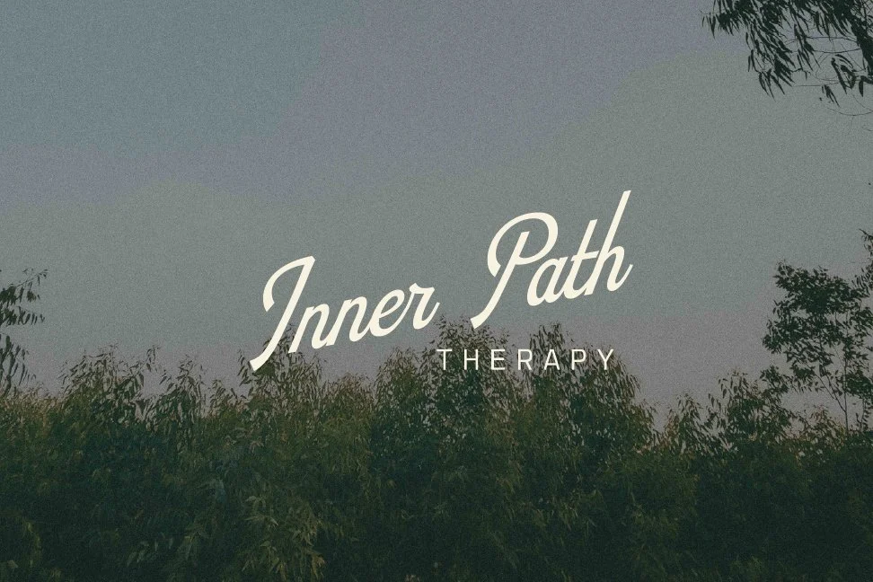
These initial directions explore a visual identity that feels calm, grounded and quietly confident. Rather than relying on the softer, more expected language often associated with therapy brands, the goal was to create something with greater presence and permanence: organic in character, but still refined, credible and highly usable.
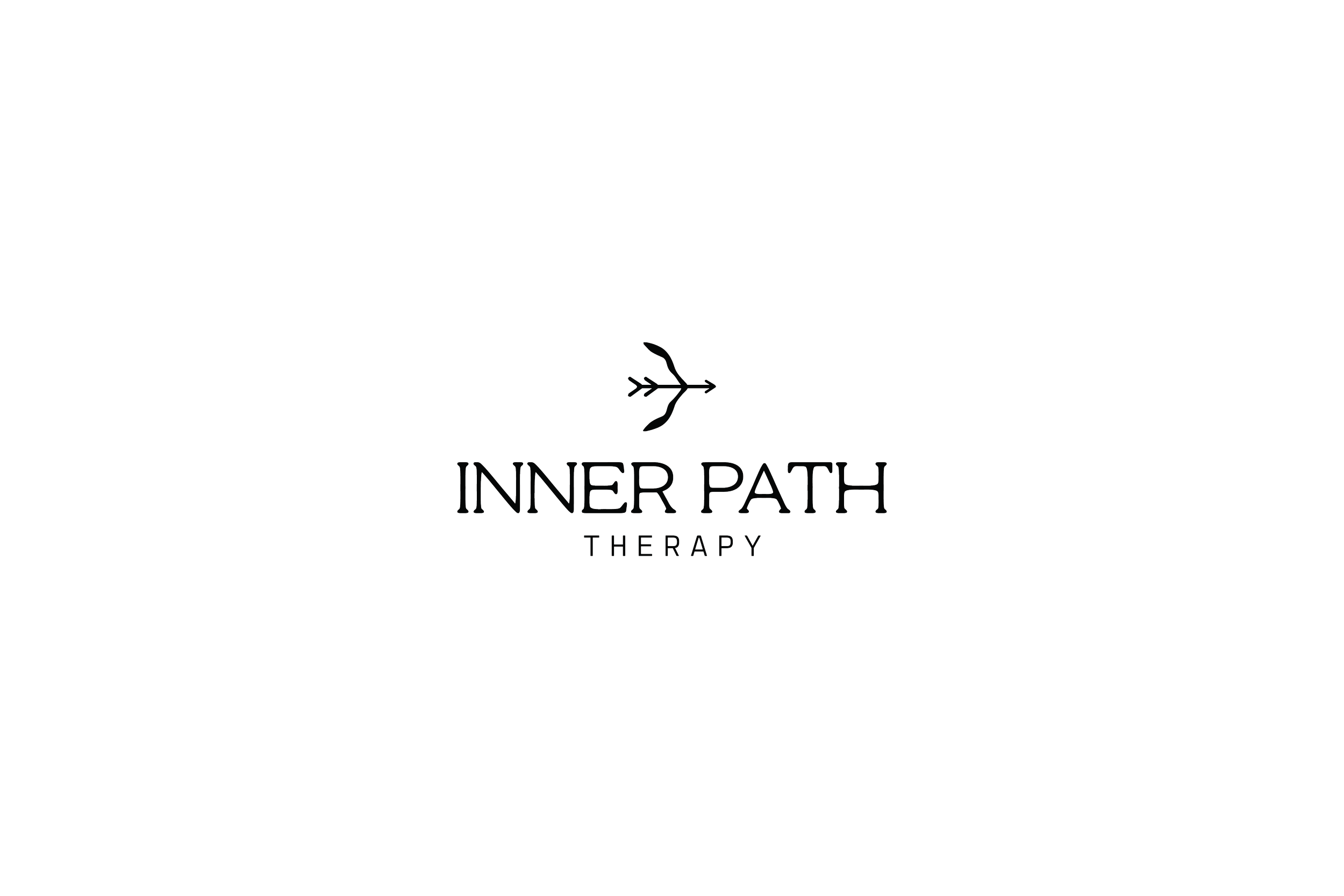
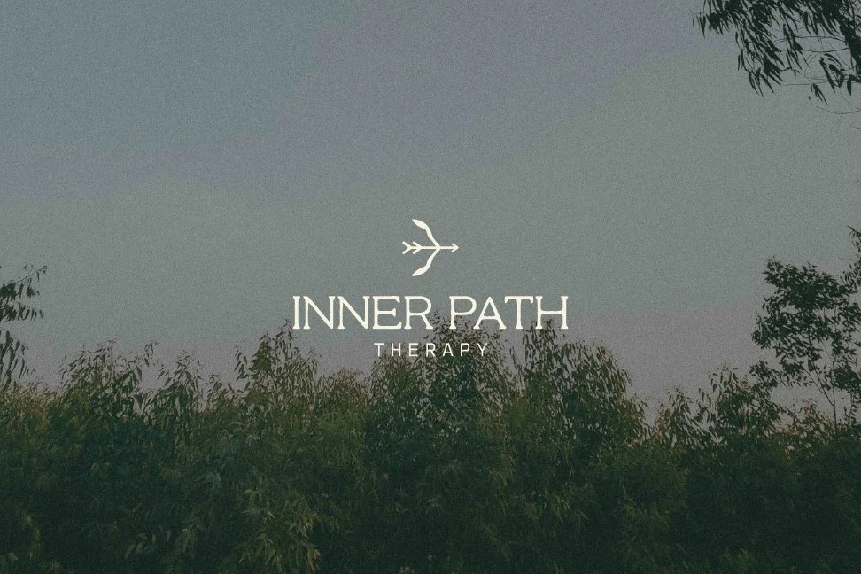
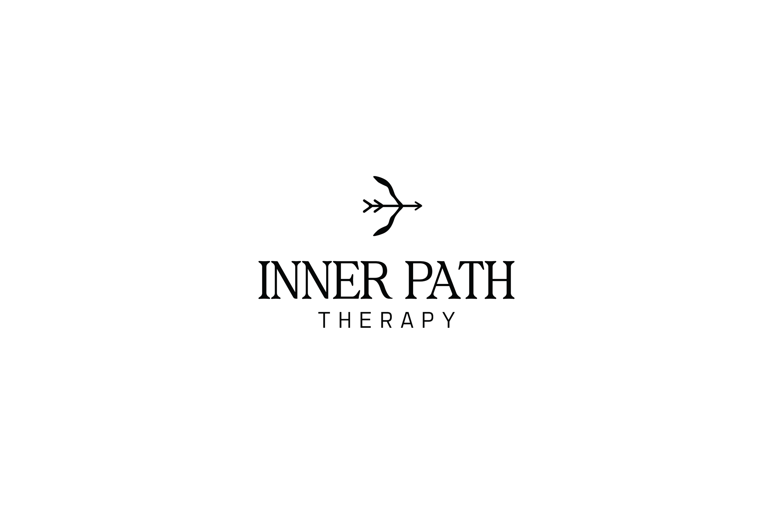
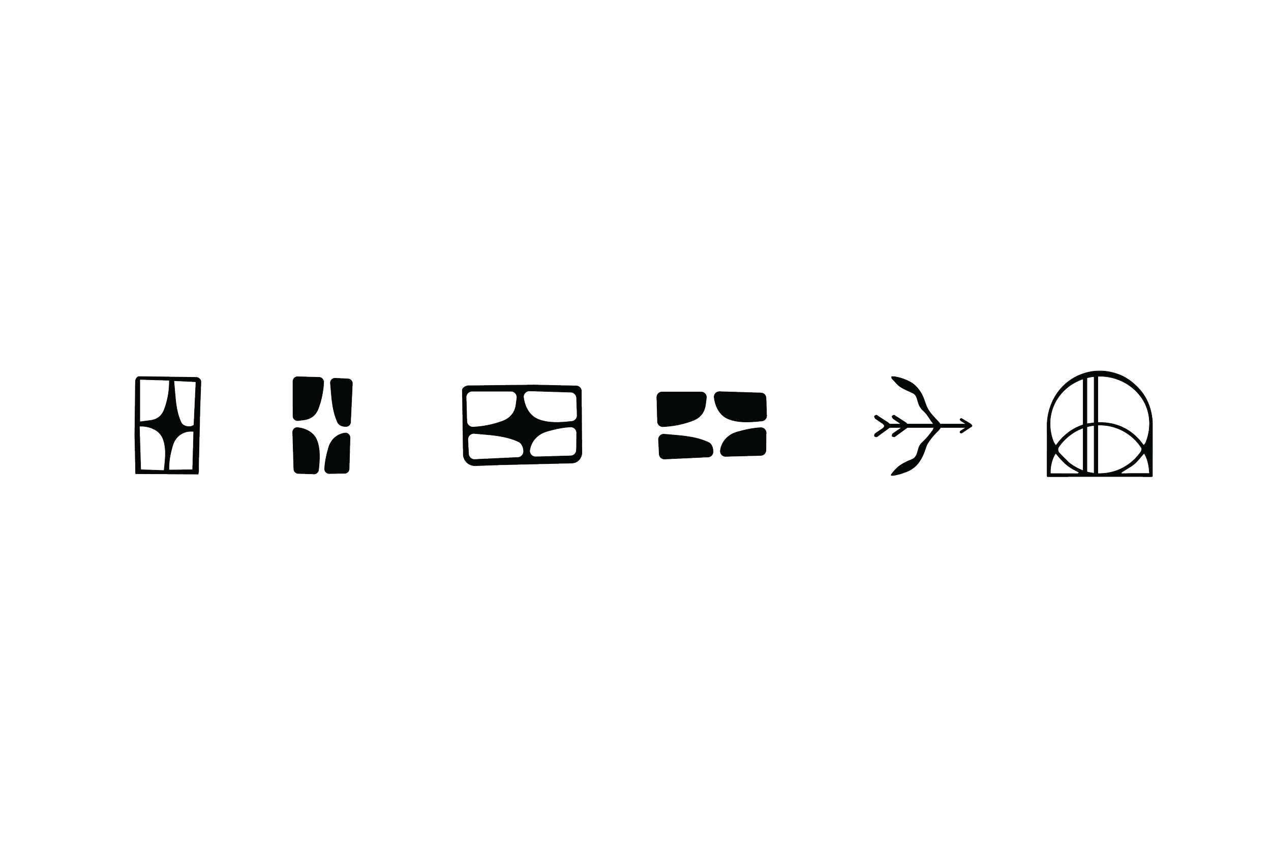
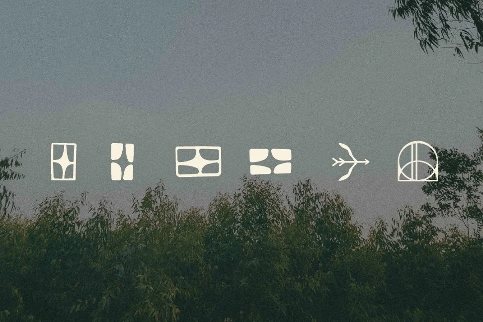
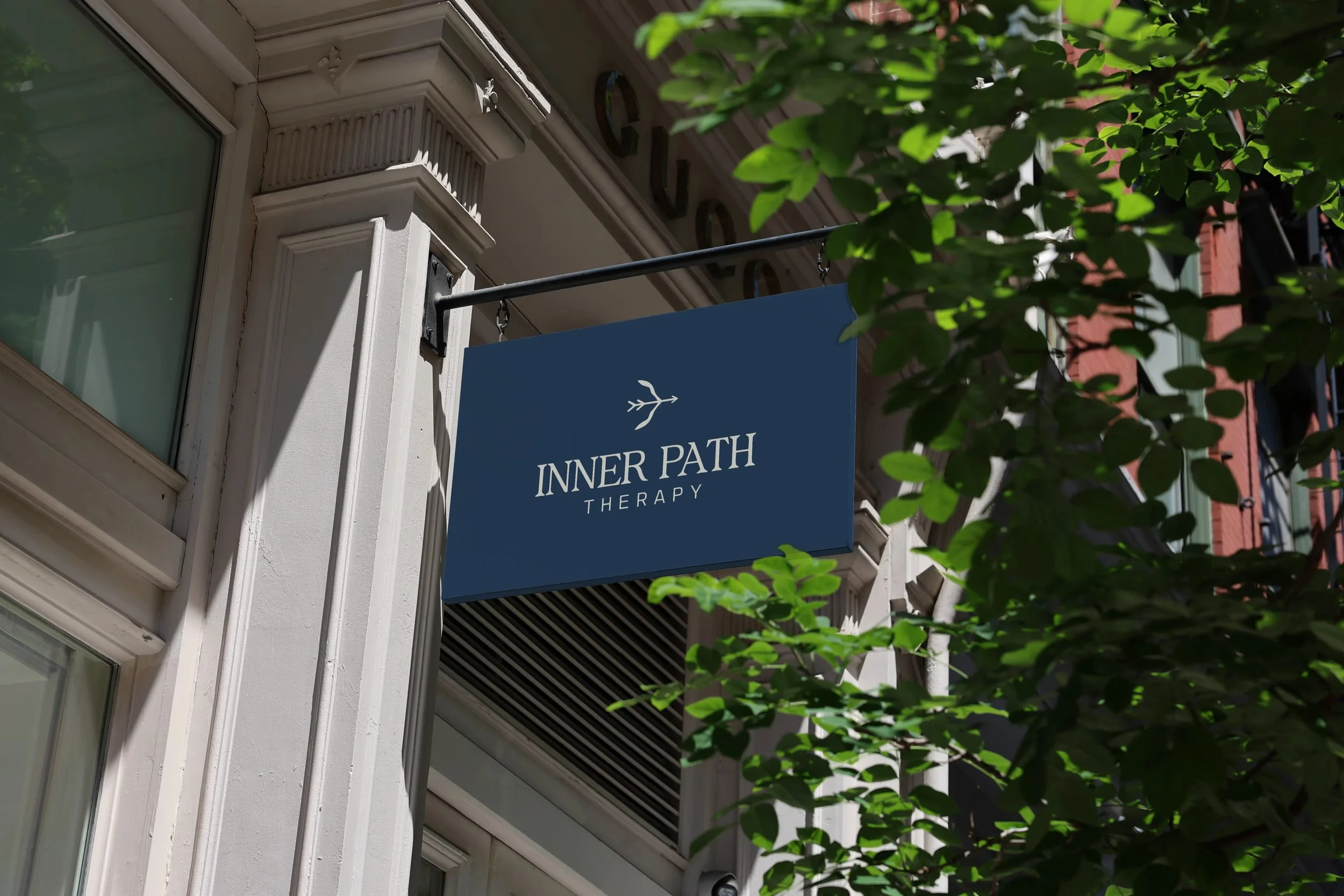
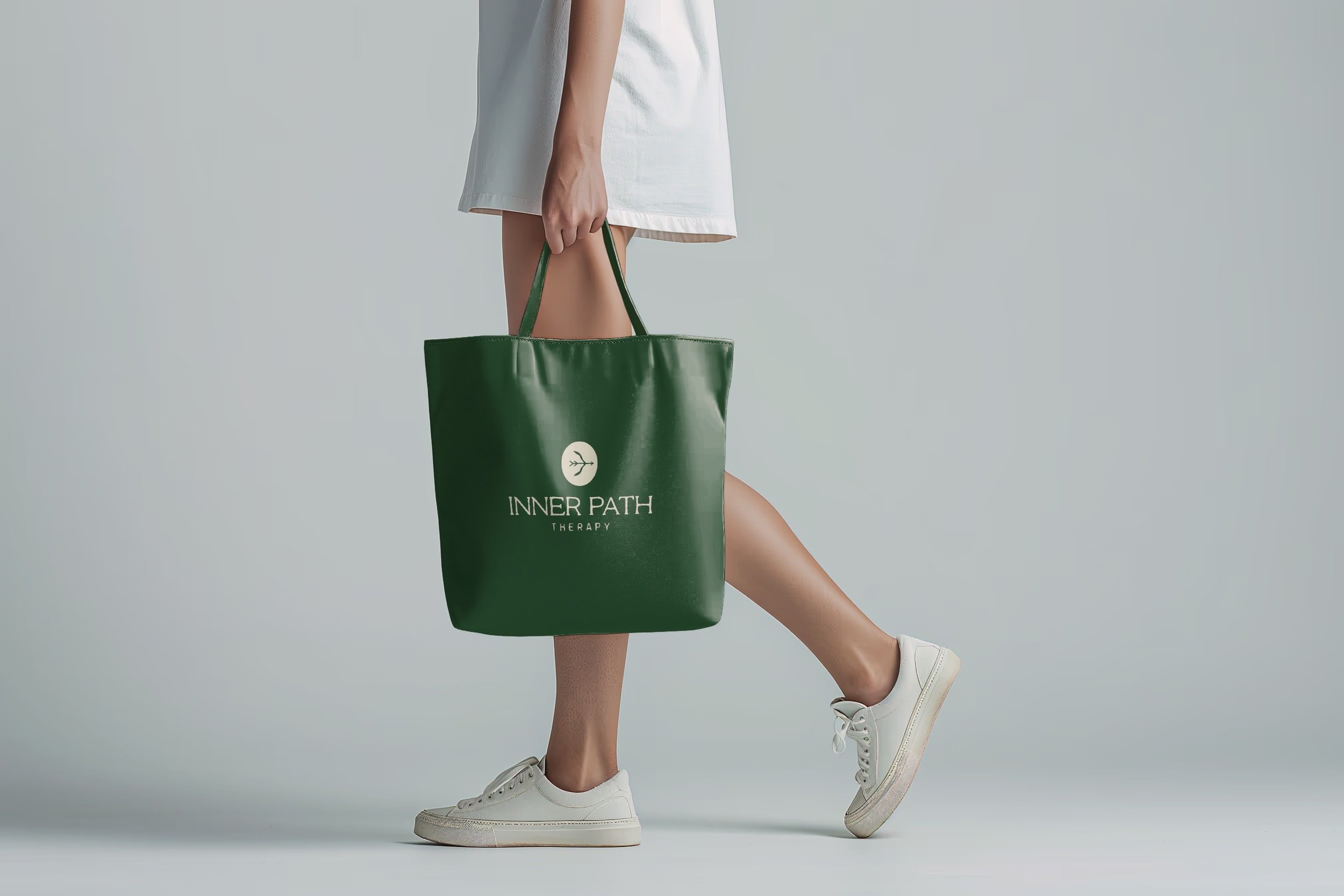
Several concepts build from the personal meaning of the bow and arrow, with the bow itself taking on a more natural, form, allowing the symbolism to feel human and organic rather than sharp or overly literal.
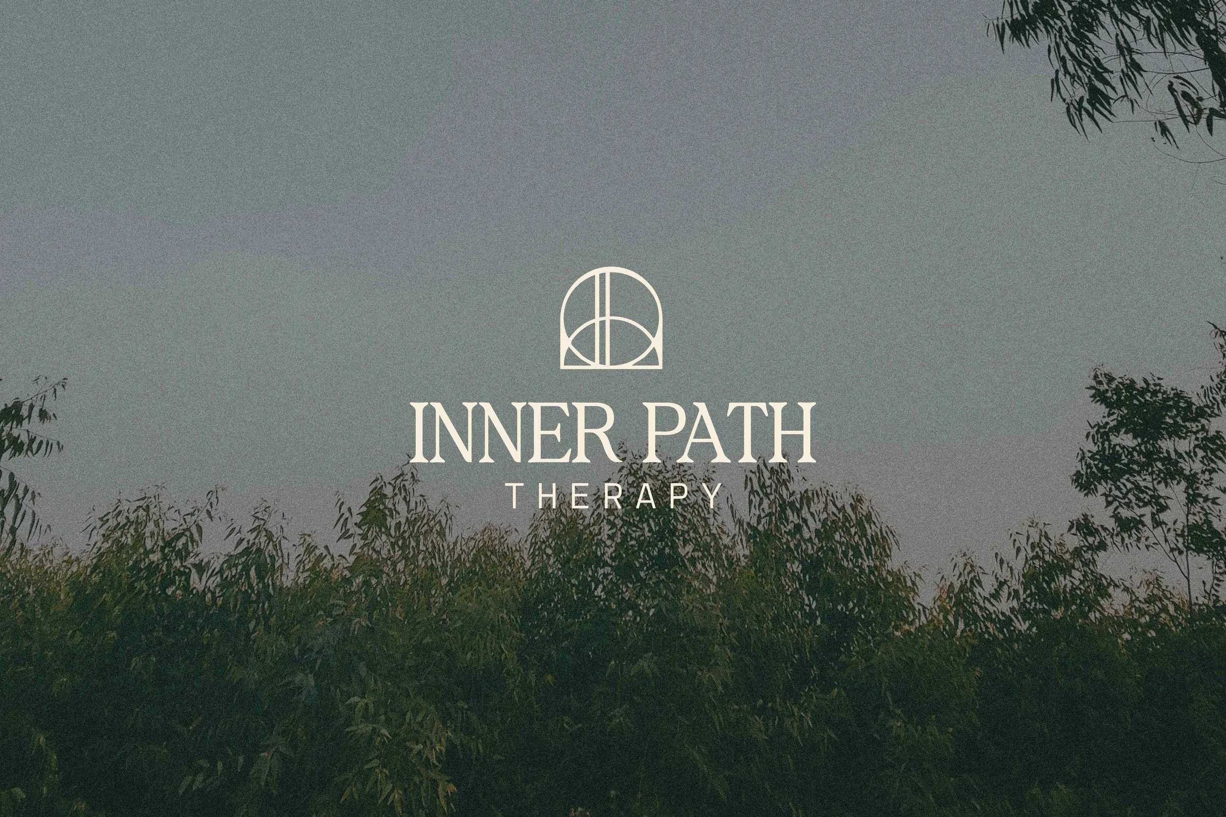
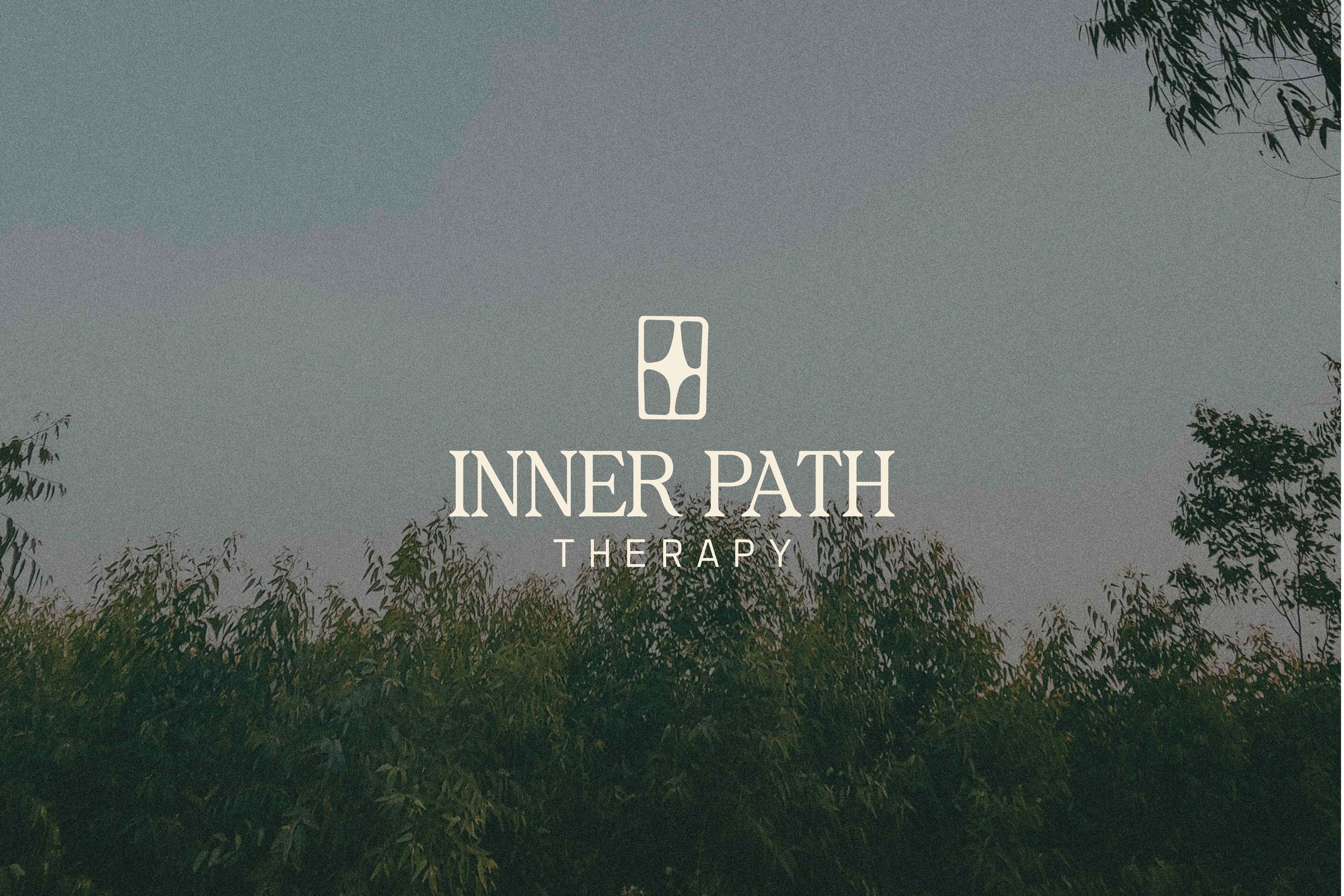
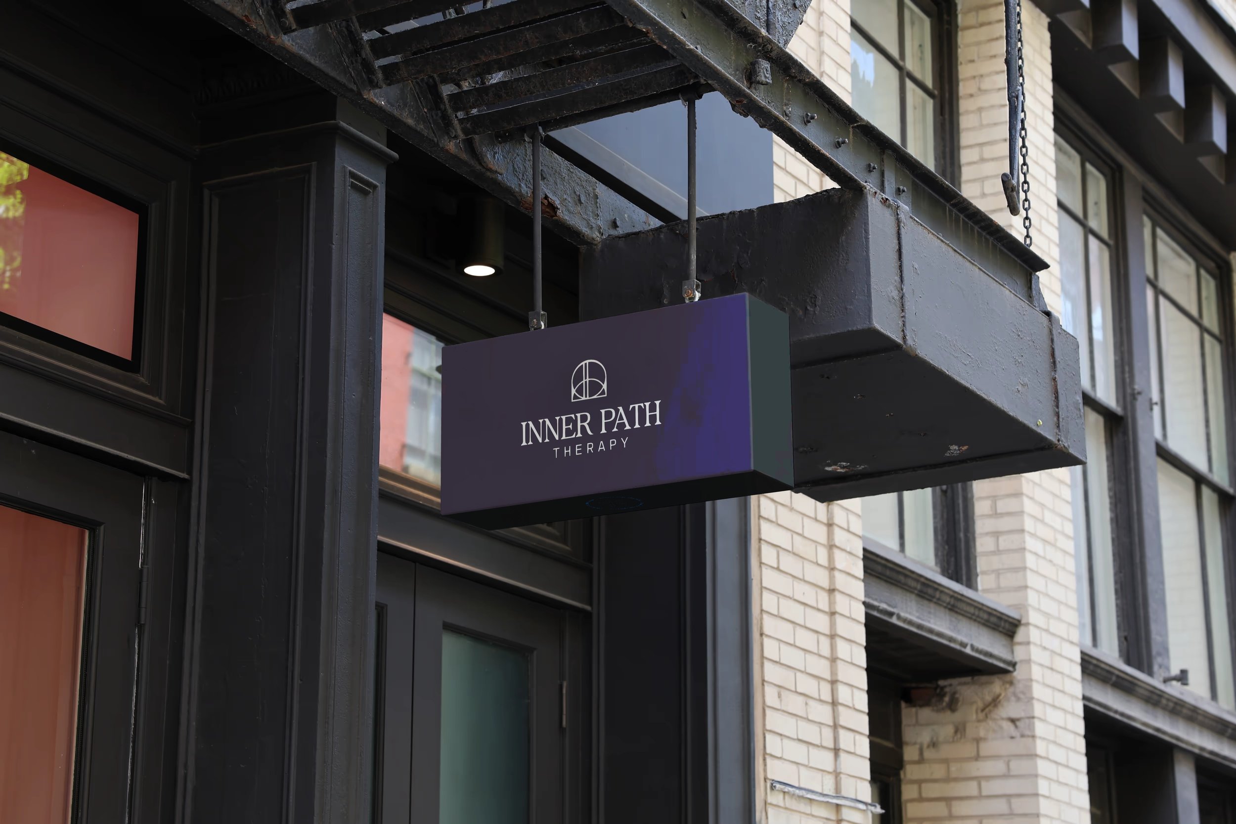
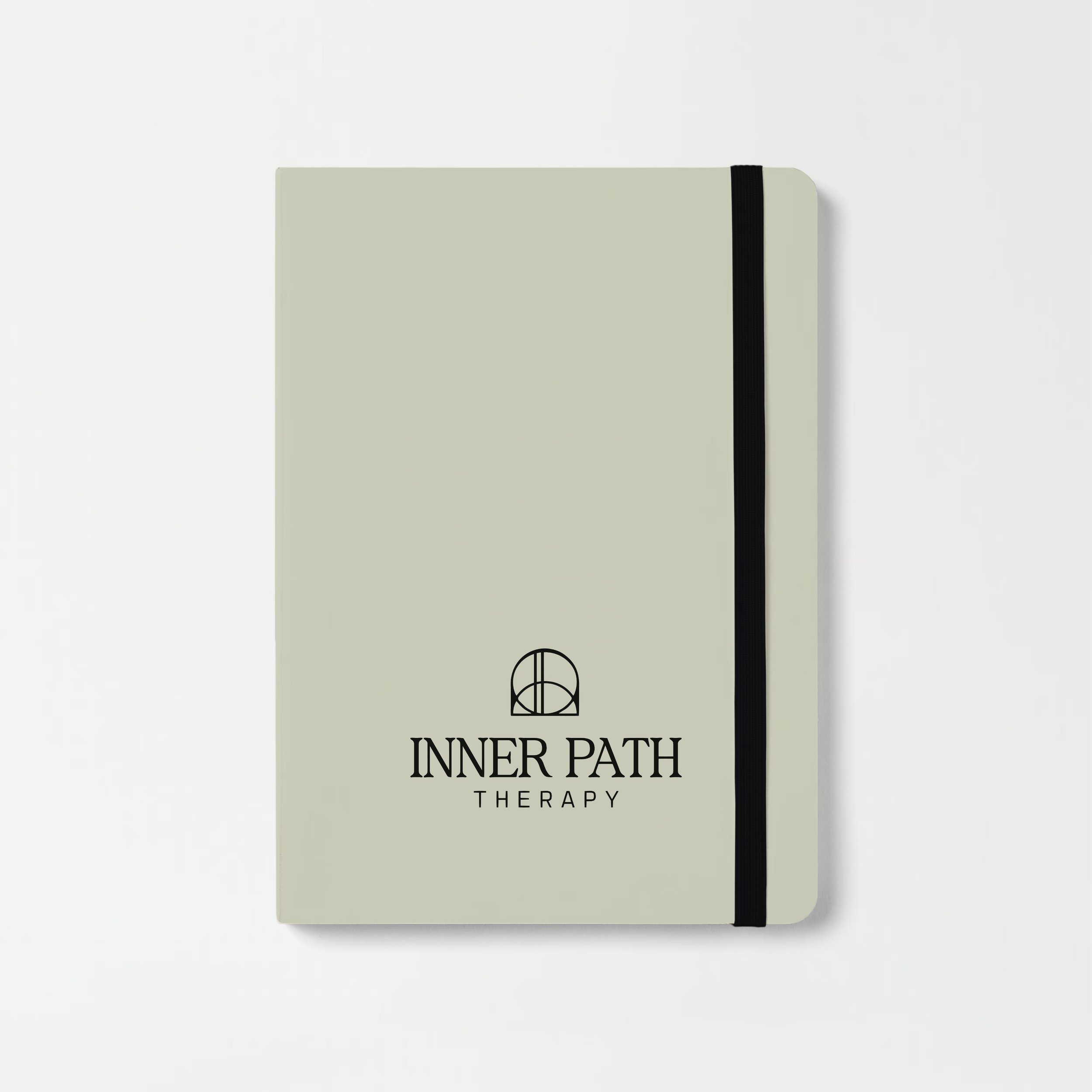
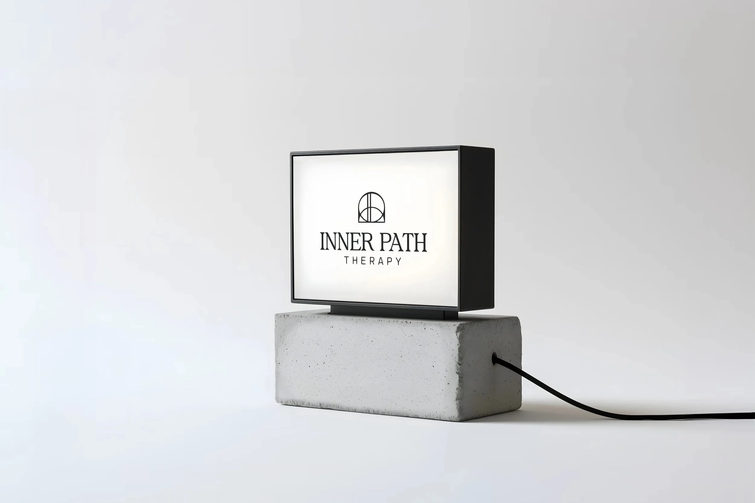
The arched concept introduces the idea of an opening or passage, reinforcing Inner Path as a place of reflection, movement and discovery - it’s also a play on an “IP” monogram.
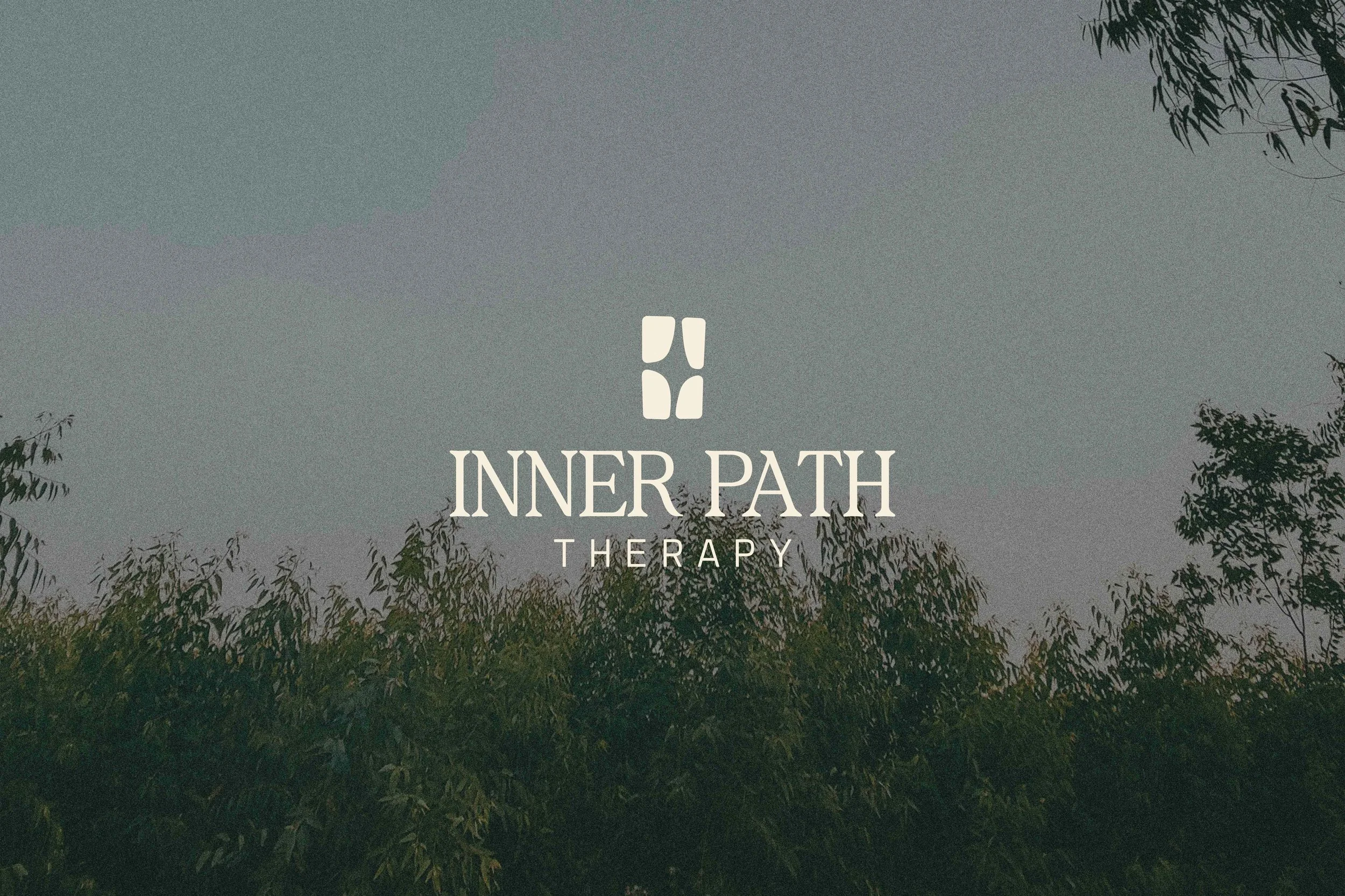
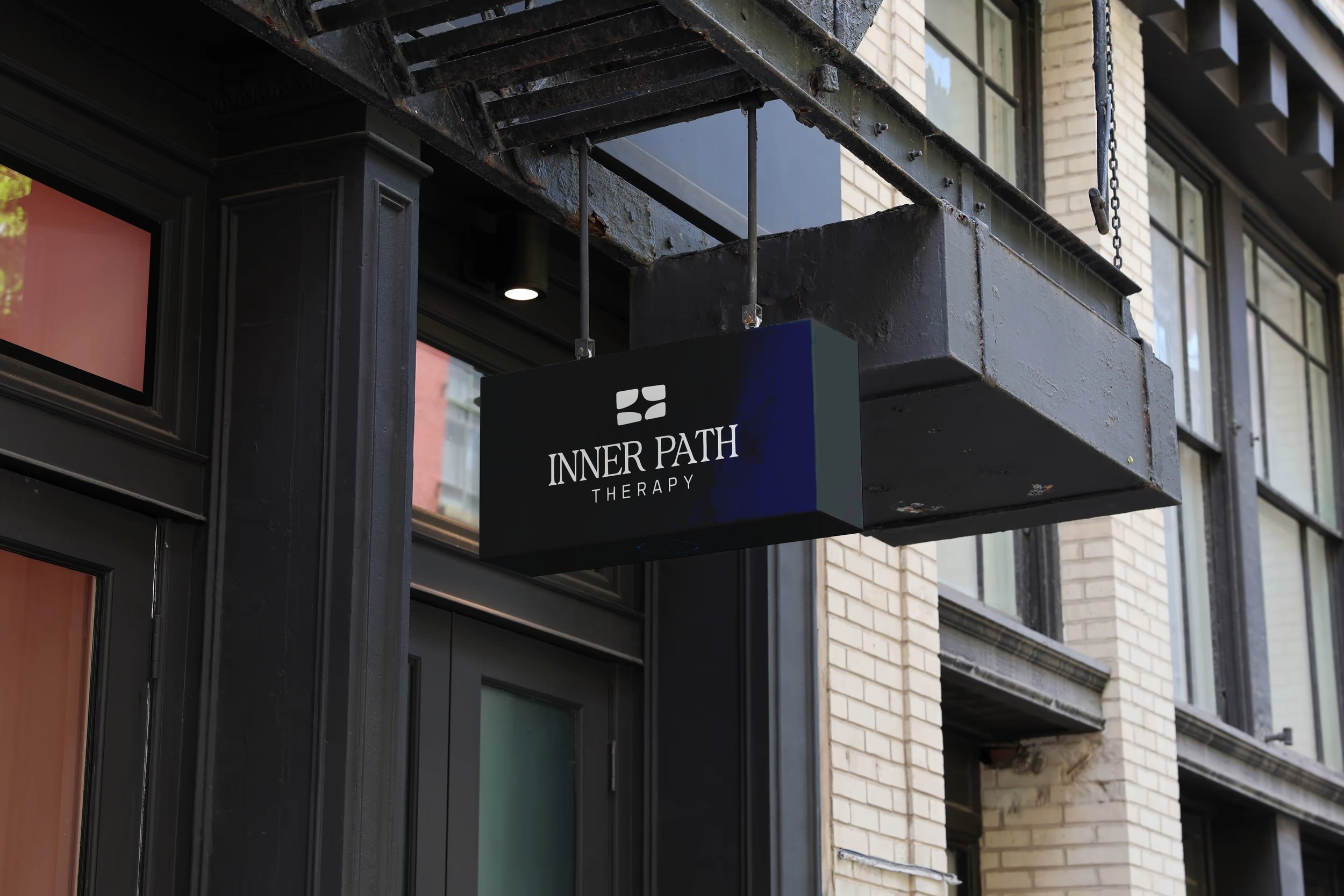
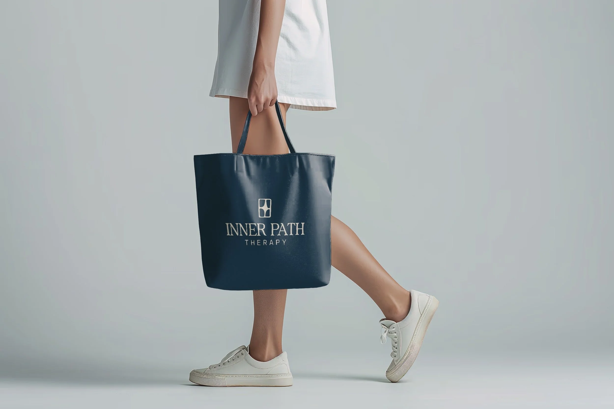
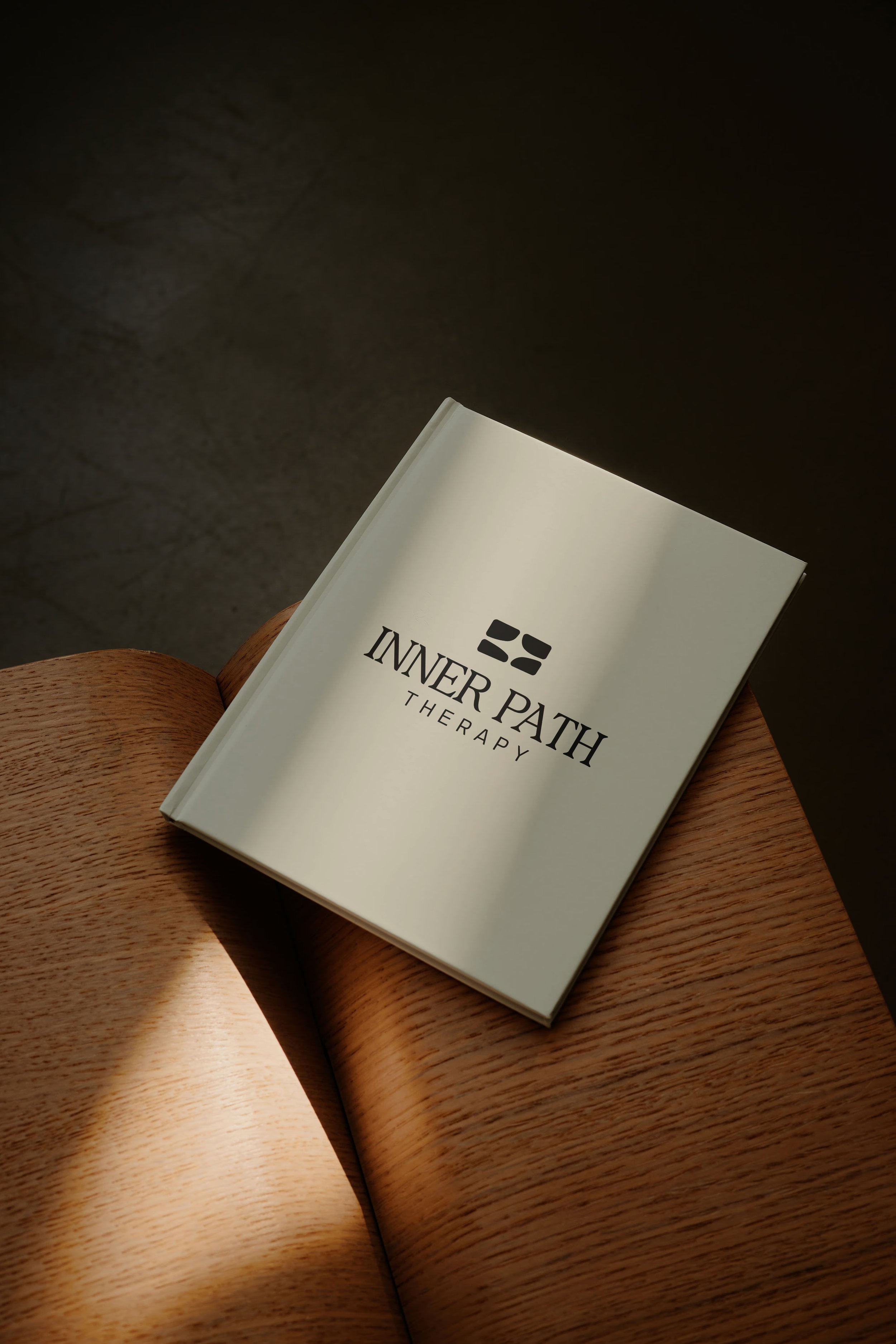
The additional marks broaden that same story (they are all orientations of one base design…vertical vs horizontal). Rounded, irregular forms suggest pathways, thresholds and orientations gradually finding relationship with one another. They speak to the inward work of therapy: creating space, uncovering patterns, restoring connection and finding a way through.
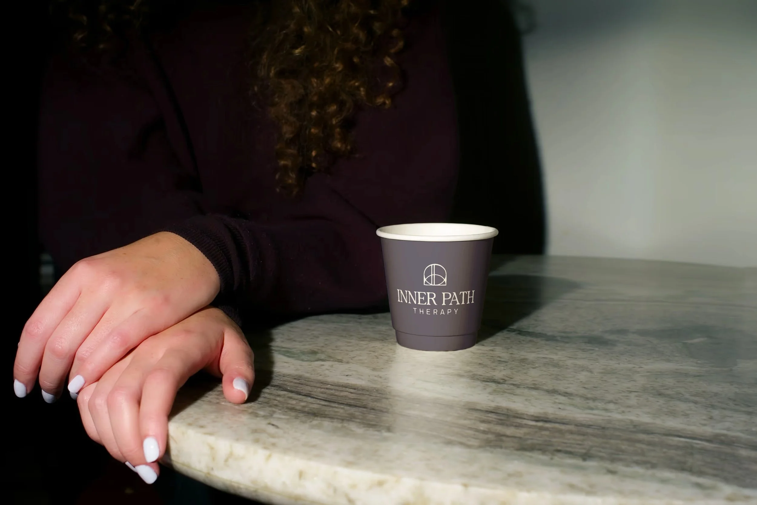
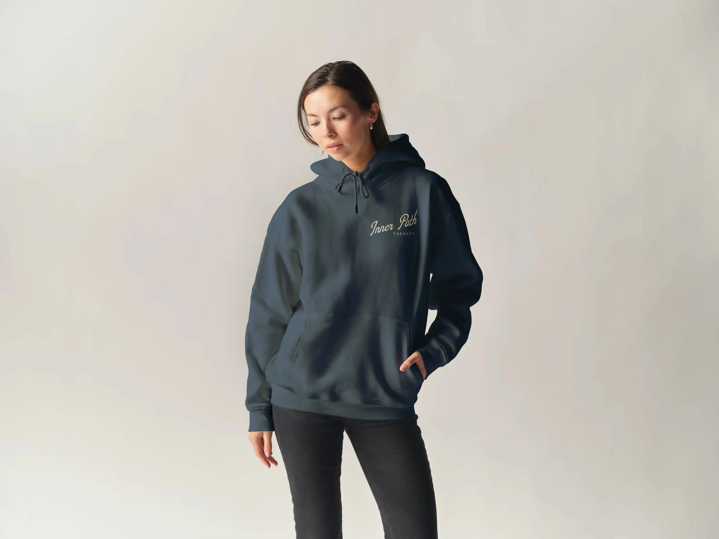
Across the collection, the typography and restrained palette are intended to balance warmth with professionalism. The identity should feel welcoming without becoming delicate, earthy without feeling rustic, and meaningful without becoming overly symbolic.
These are intentionally varied starting points, created to help identify which visual language feels most authentic before refining the strongest direction into a complete brand system.