
Ultraflote, Inc.
Repositioning a Trusted Leader
Ultraflote Design - Concept & Ideology:
In today’s industrial and infrastructure sectors, credibility isn't just built on performance — it's communicated through design, message, and presence. Ultraflote has a 50+ year legacy of excellence, and our aim is to align the touchpoints of the brand to reflect the innovation, precision, and global capability it delivers. Rebranding and repositioning — it’s a recalibration of how Ultraflote shows up in the world.
Evolving the brand presence to match the strength and legacy of its engineering.
Competitive Pressure & Market Expectations
Ultraflote's competitors — (ie: HMT) — have embraced a clean, modern visual identity that signals modernity, trust, and scale. Their visual positioning and messaging aligns with industry expectations: technically smart, solution-oriented, and globally competent.
By comparison, the goal is to align Ultraflote’s brand identity with a modern, streamlined and even simplified trajectory, supporting the cohesion and authority that today’s buyers, engineers, and procurement leads expect from a category leader.
In an industry where trust and performance are non-negotiable, brand presentation becomes part of the proof.
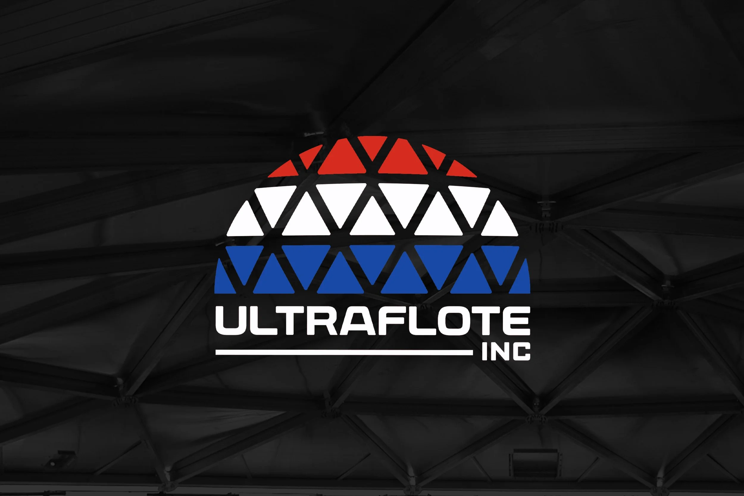
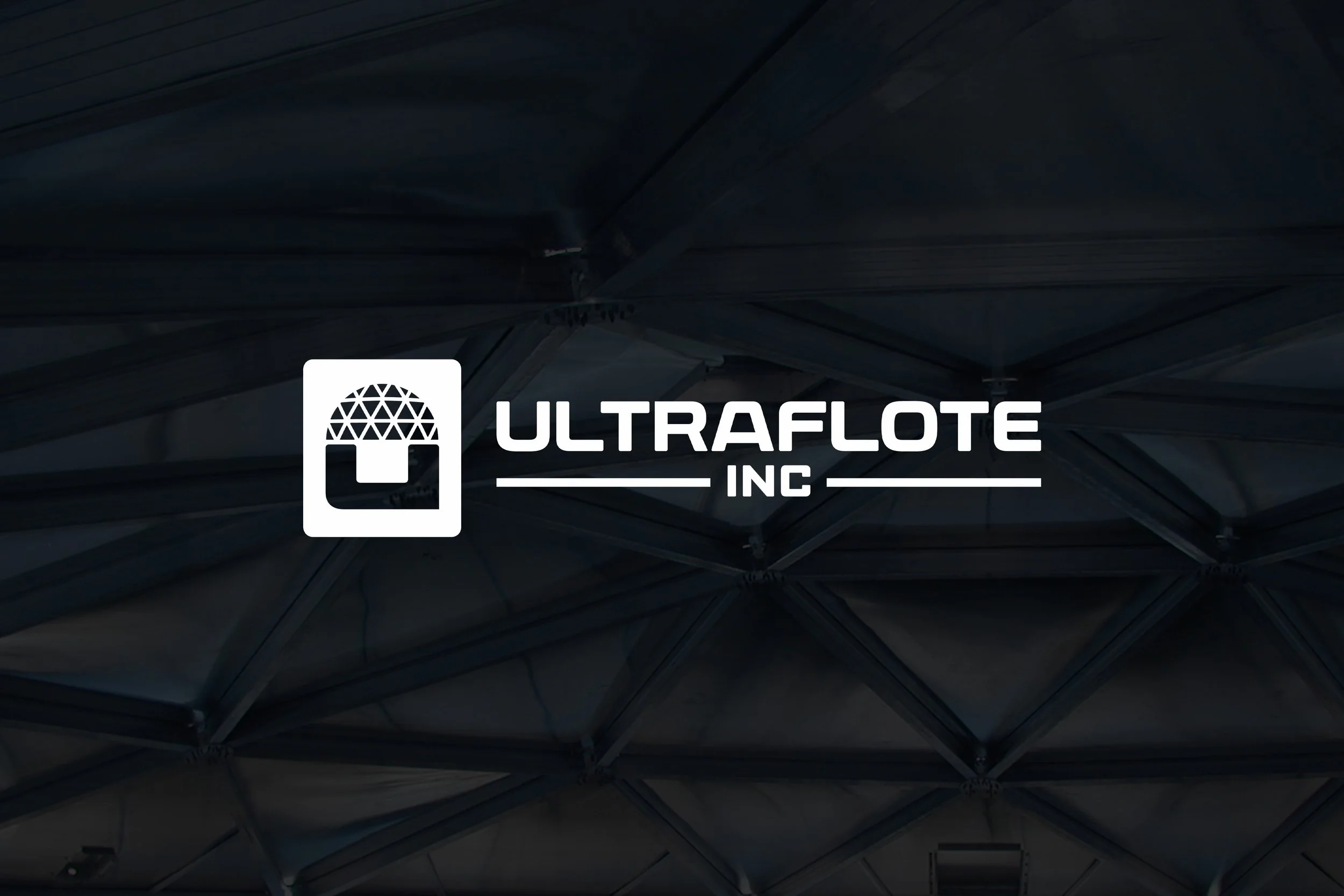
Modernizing With A Nod to Legacy Era
The new Ultraflote logo simplifies and strengthens the visual identity. Inspired by a geodesic structure and industrial form, the custom mark is designed for clarity, scalability, and impact across a wide range of applications. Modern with a nod to an design reminiscent of the legacy/foundation era of Ultraflote…a design that aims to be transcendent of time.
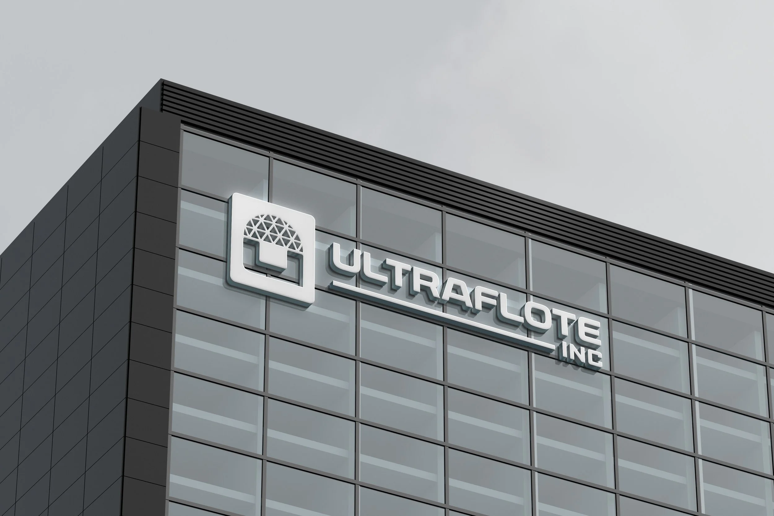
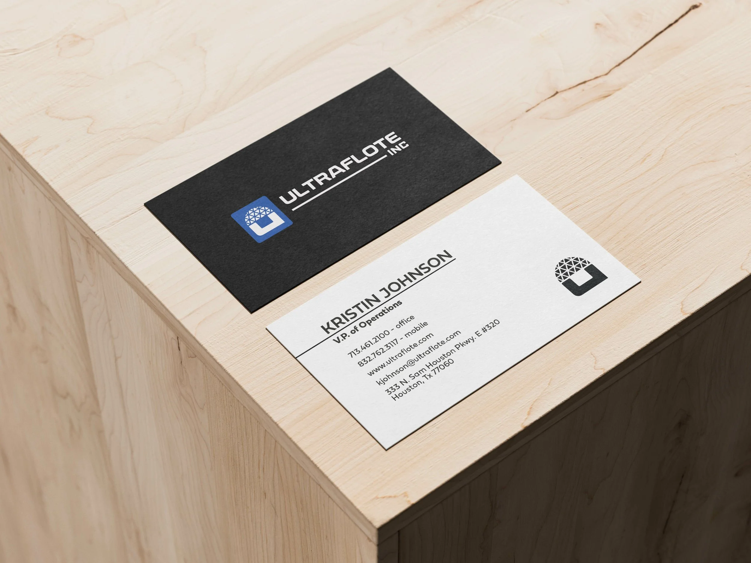
Applied Design: Use Cases
These examples show how the refreshed Ultraflote brand can be extended across real-world environments and touchpoints. From apparel to site signage, consistent application reinforces credibility and recognition.


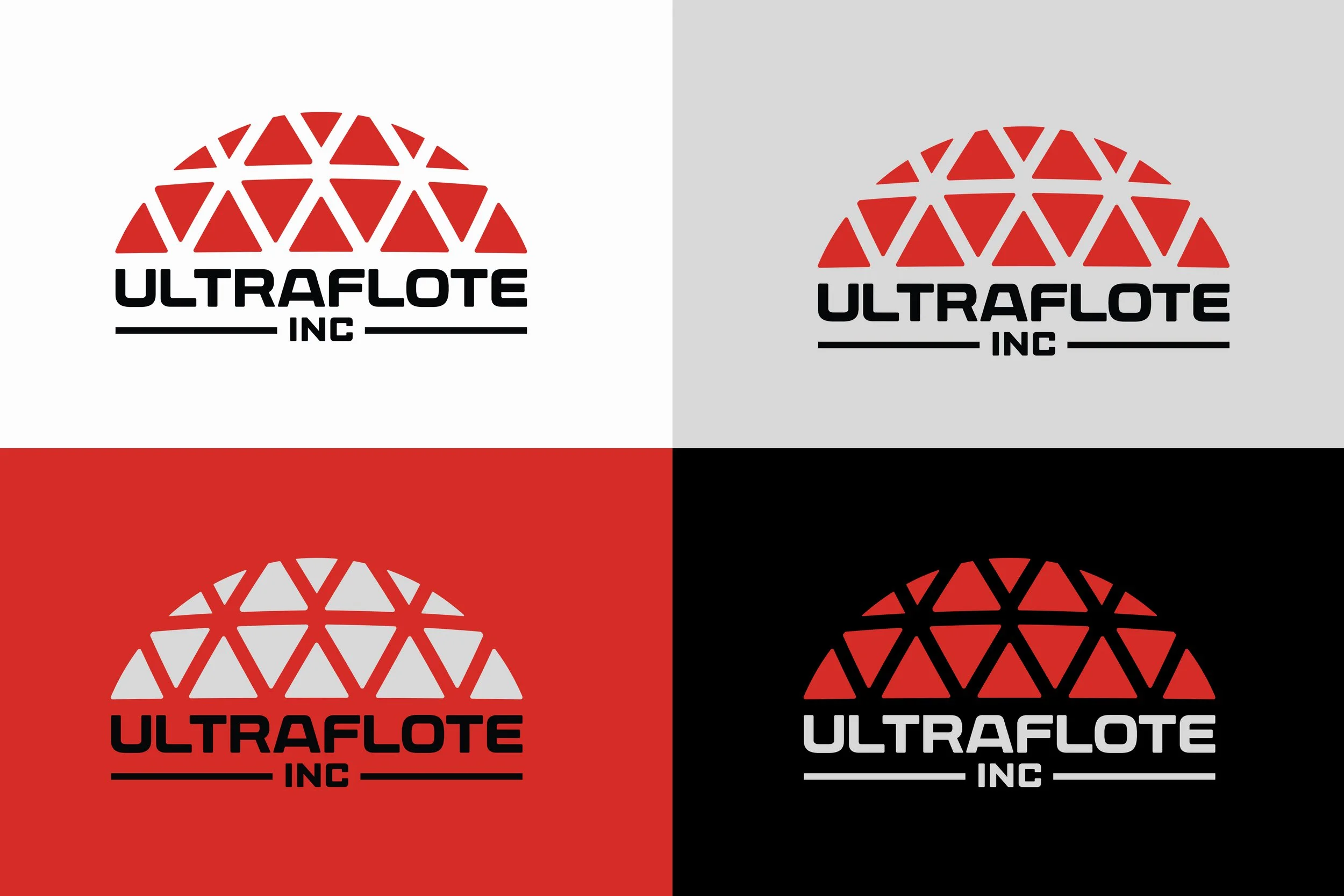
Ultraflote Logo System: Red Revisions


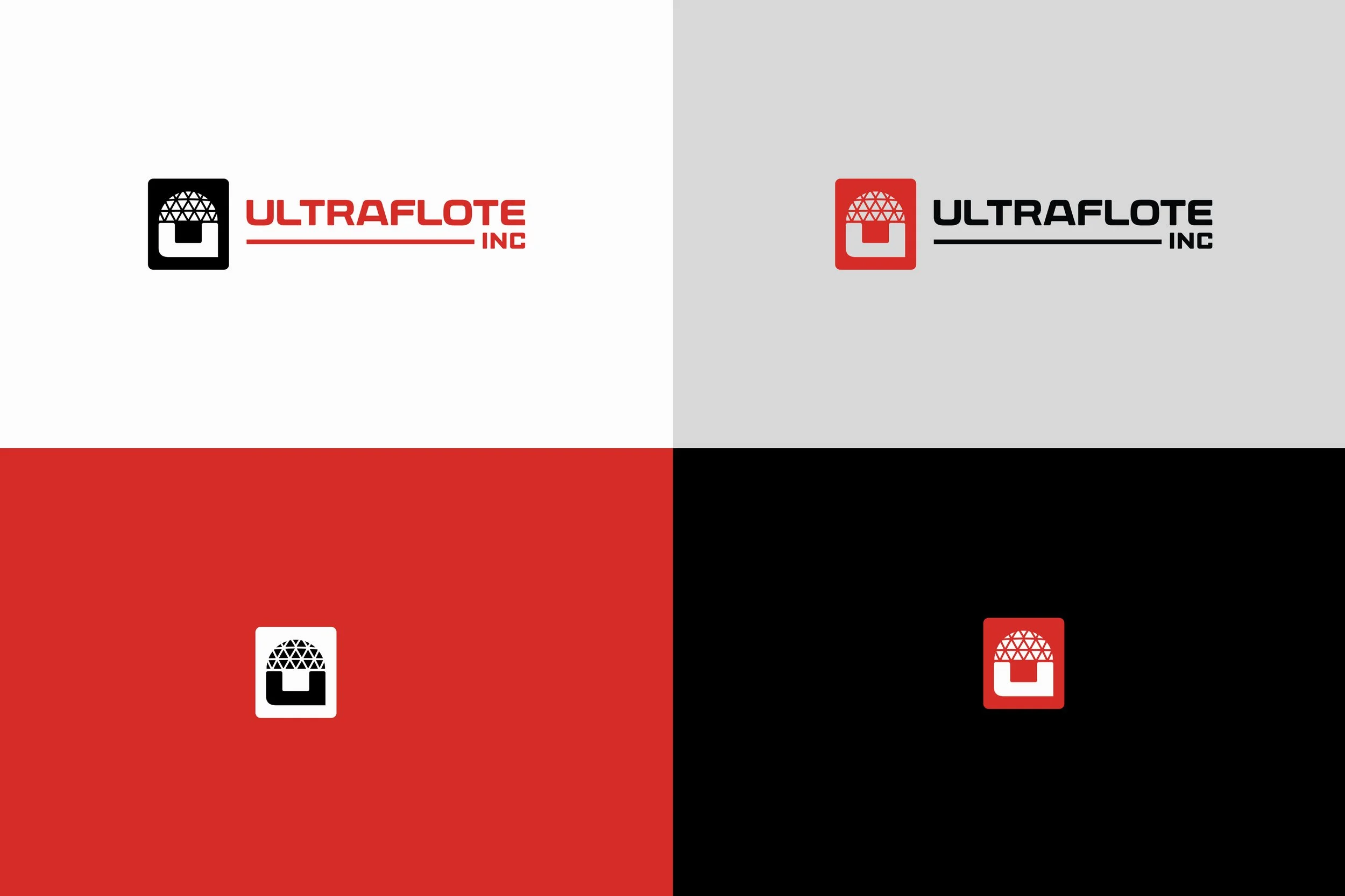
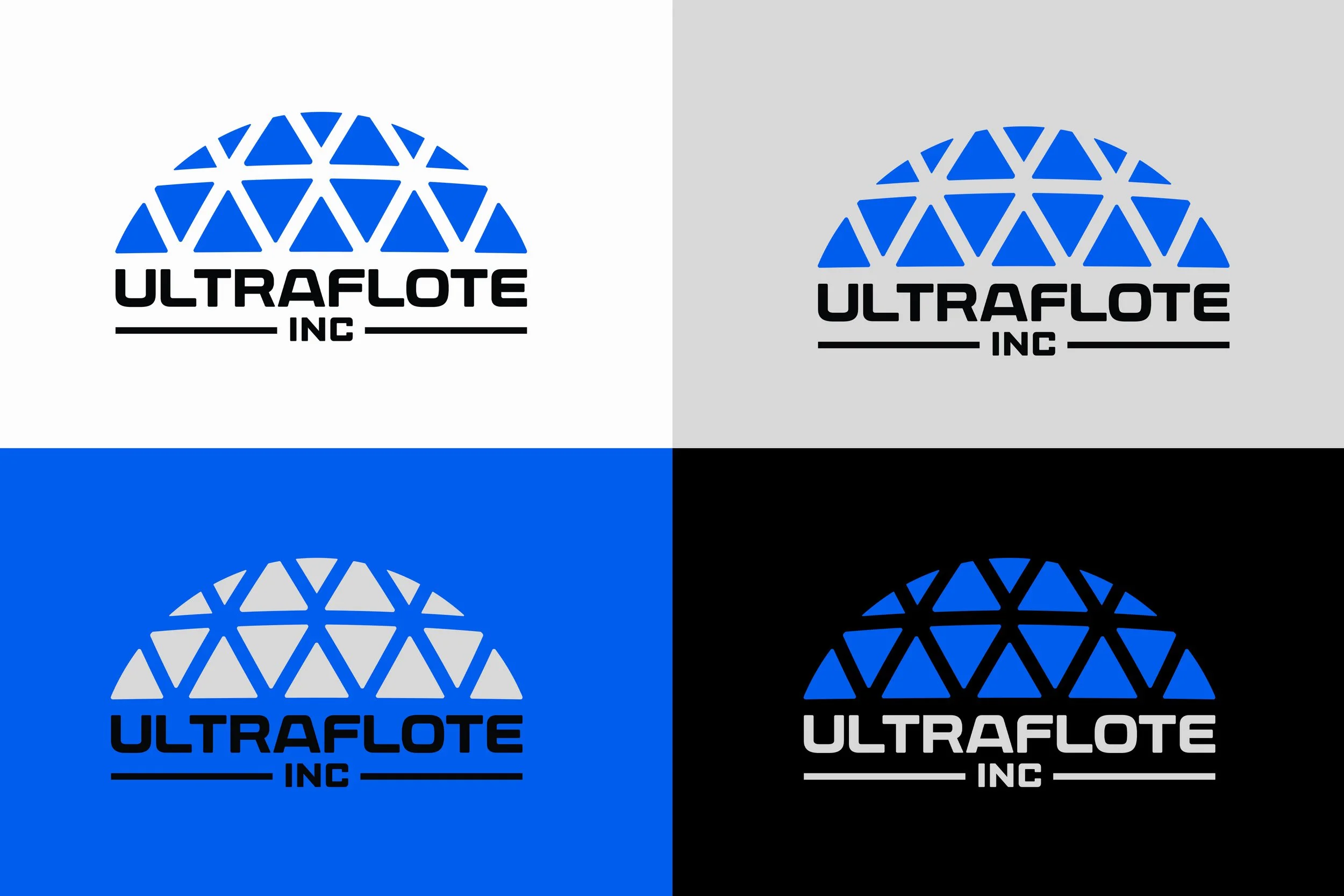
Ultraflote Logo System: Blue Revisions
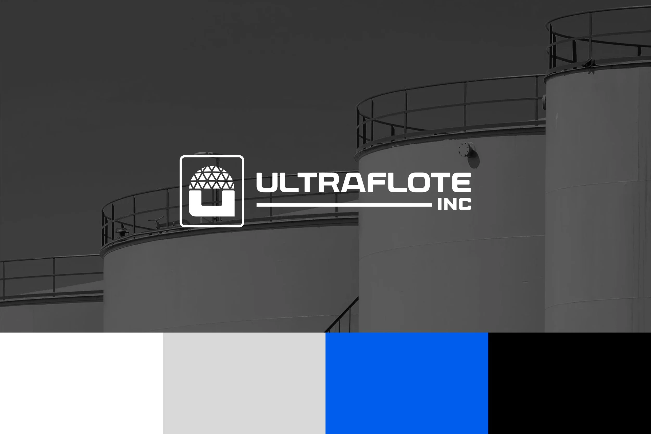


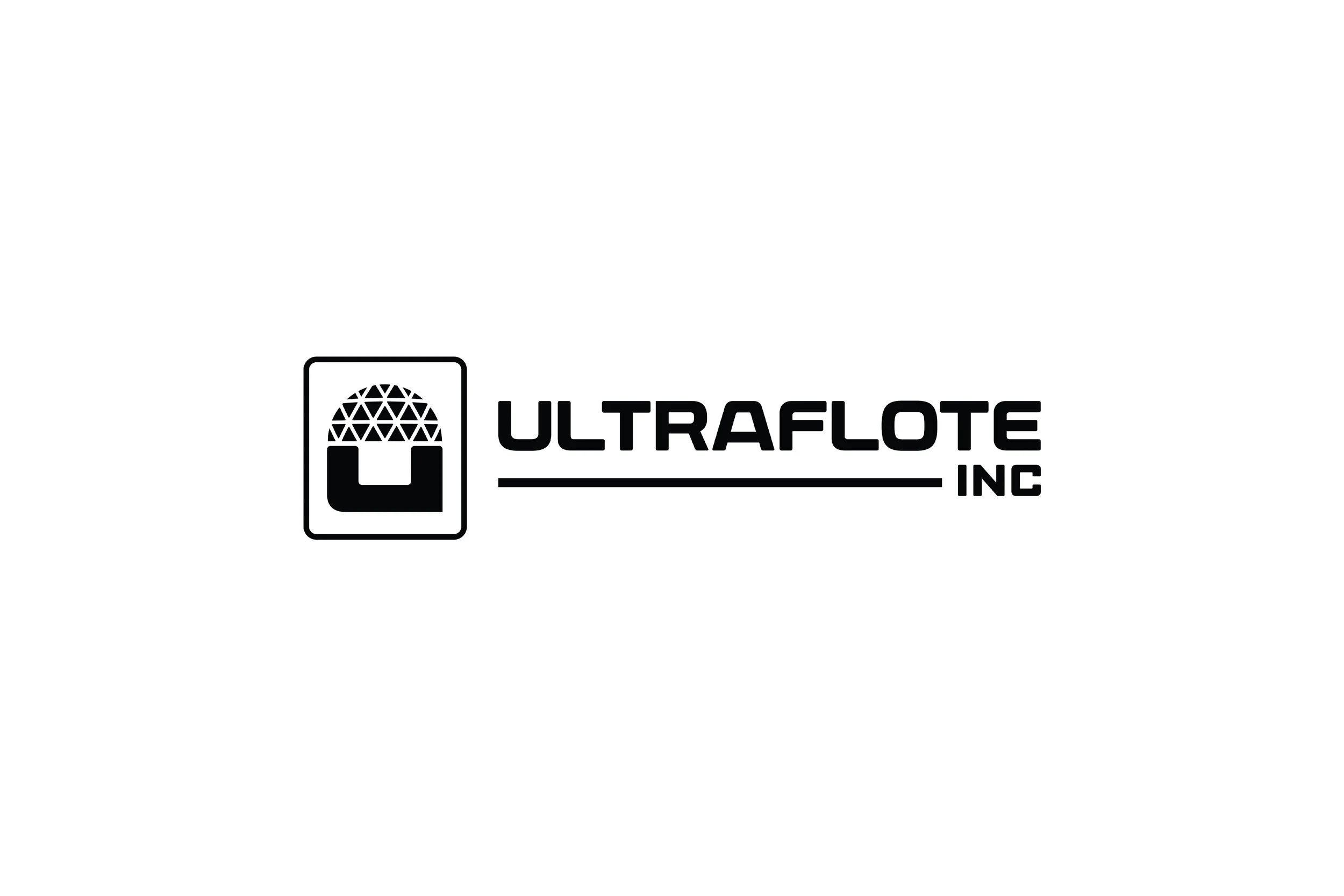
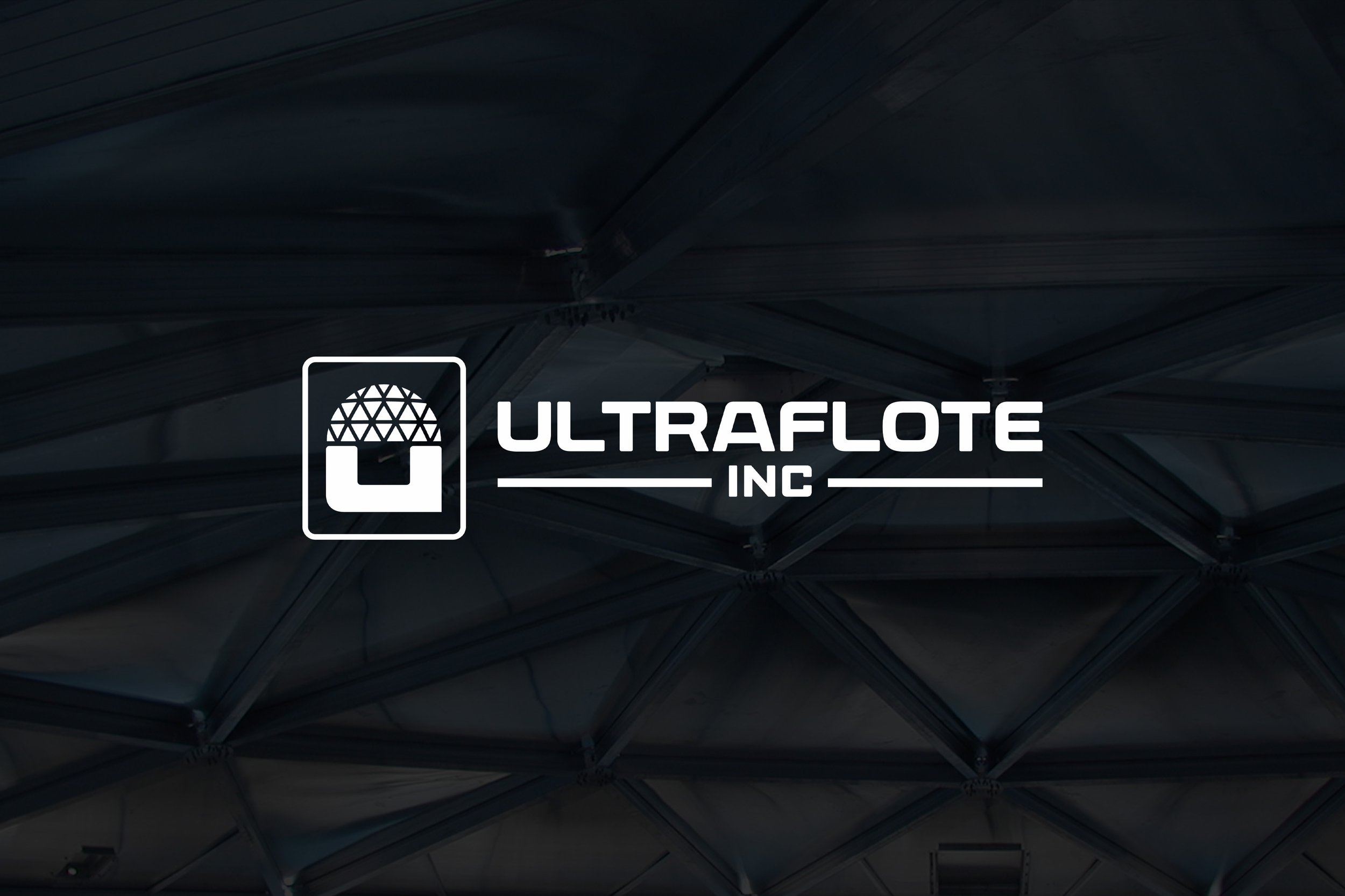
A New Ultraflote Icon
As part of the rebrand direction, we’ve created a modern, clean icon that functions as a versatile brand mark — designed to work across a wide range of applications - digital, environmental, and print. It’s designed for gear, site signage, and small-format deployment — ensuring Ultraflote is always recognizable.
Red, White & Blue
As we’ve worked to develop a new brand identity that both modernizes the visual presence, and gives a nod to vintage iconography that was reminiscent of a legacy era, the challenge to also incorporate Red, White & Blue is beginning to feel a bit ‘forced’. Both in color/design and in meaning/connection. If the importance is communication the connection to American-Made/Americana, I’d suggest some supplemental ‘Made in the USA’ and or American Flag iconography in various supporting materials. But, not pushing the Red/White/Blue to drive the brand identity. Looking through industry leaders across similar sectors, you’ll notice predominantly 1-2 color designs that drive brand identities, with a continual shift toward (or back toward) simplicity and iconography.
*This might be an instance where the need is to lean more toward the intended audience vs internal preference.