Design Notes:
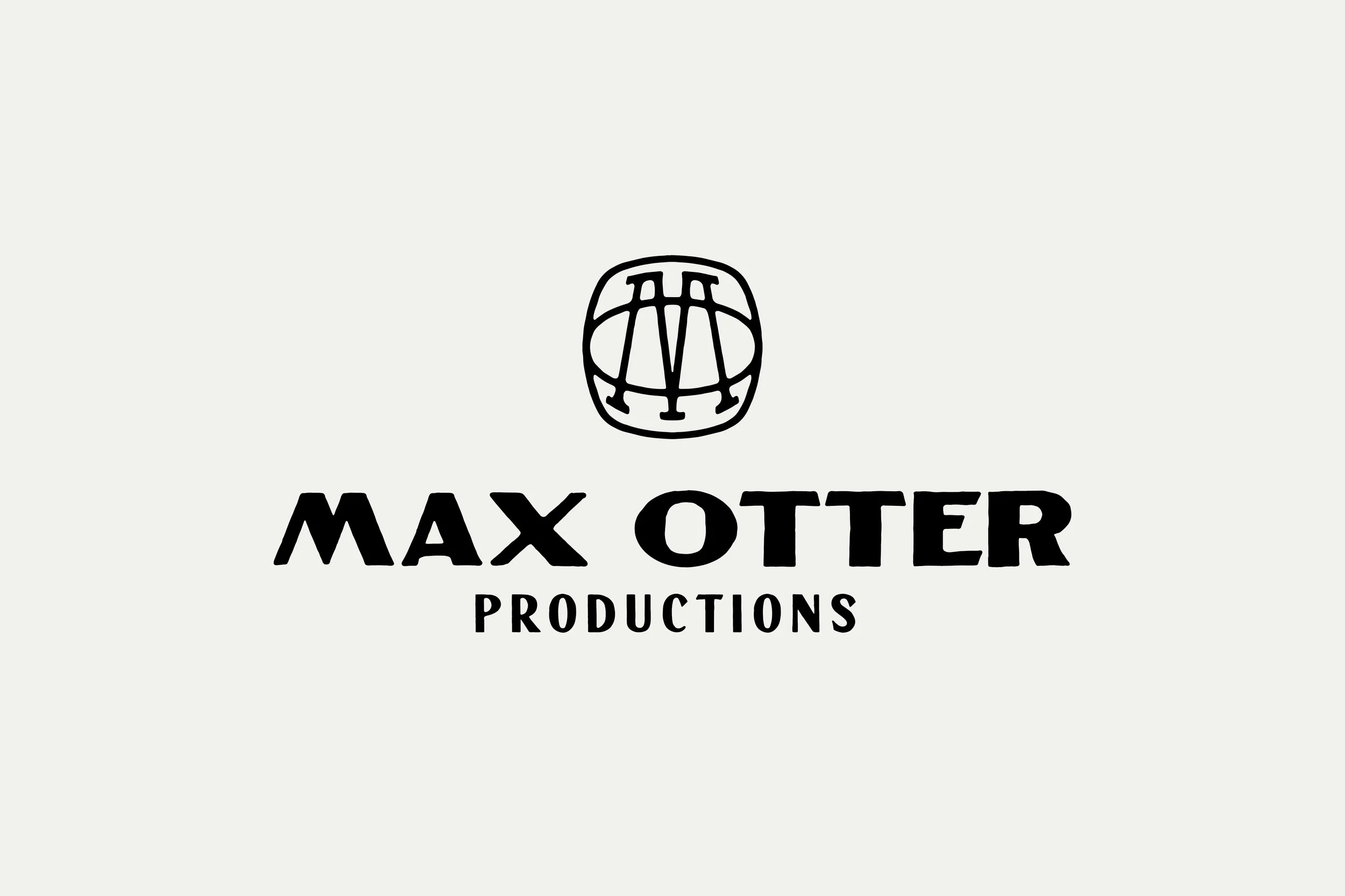
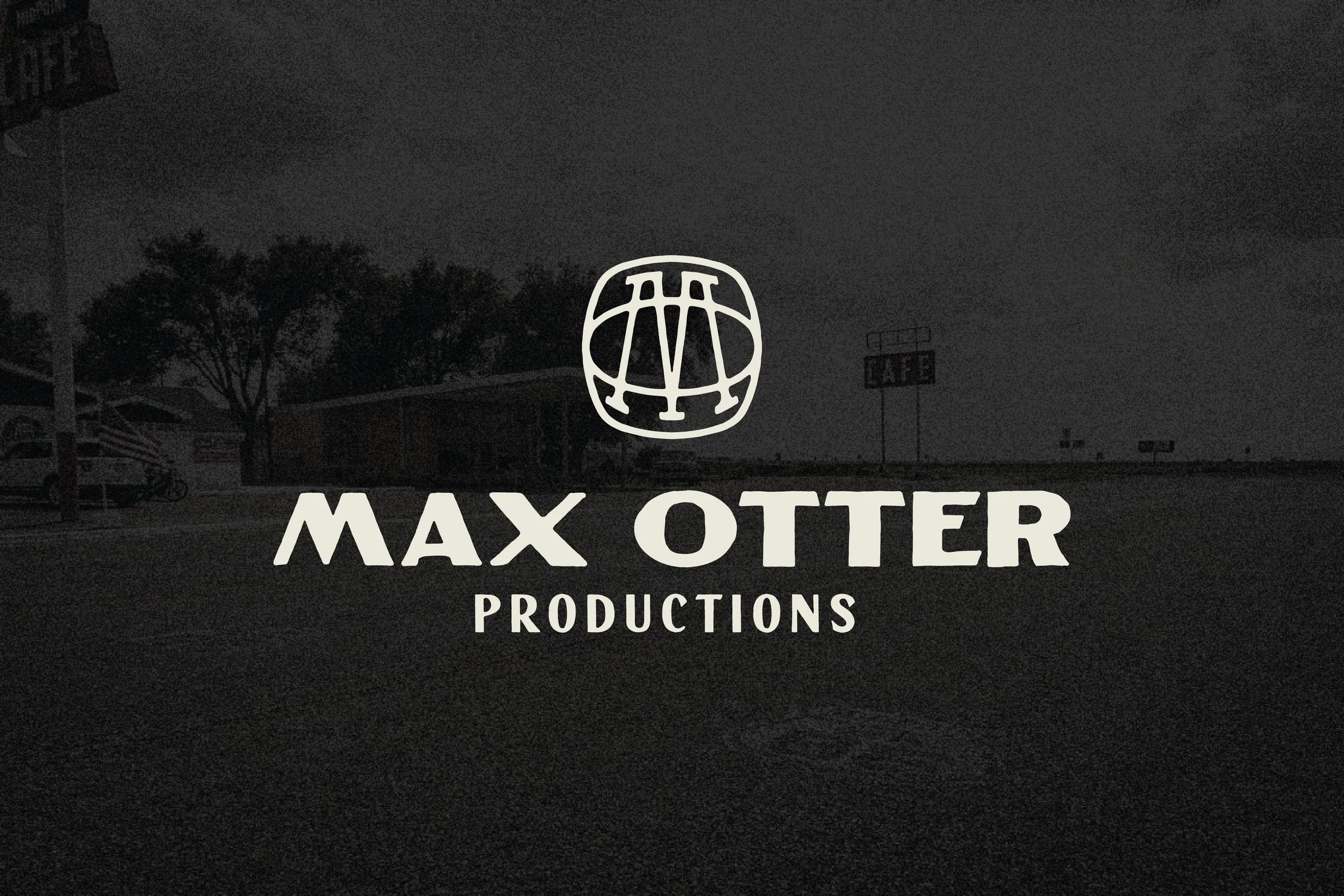
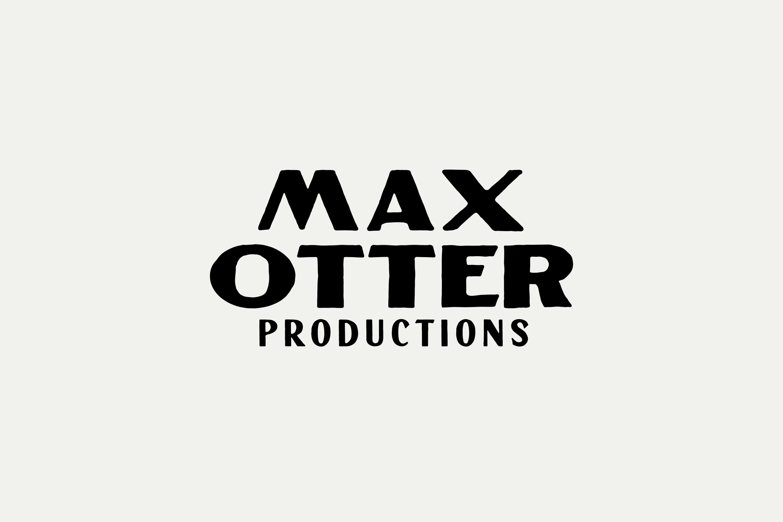
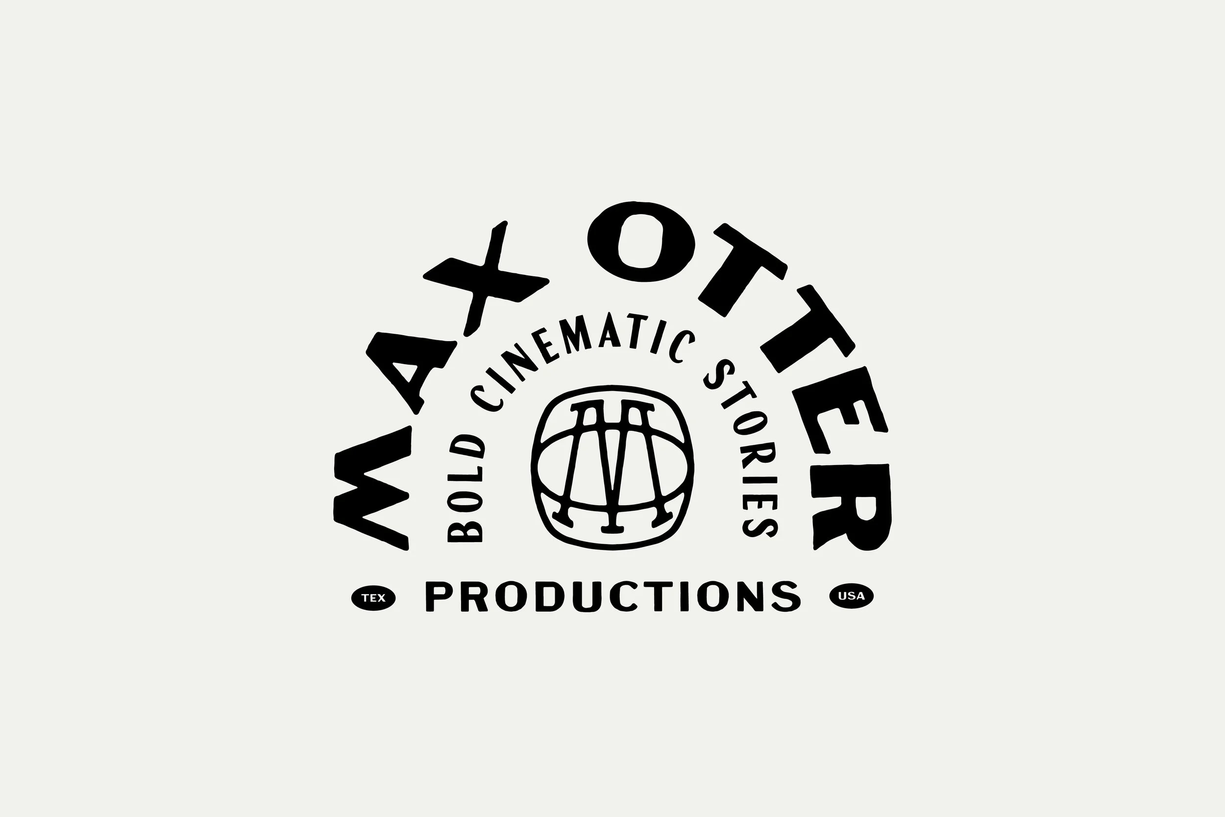
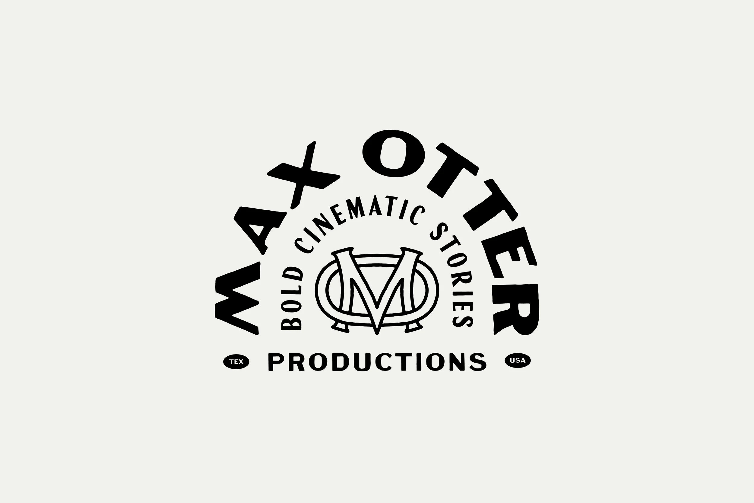
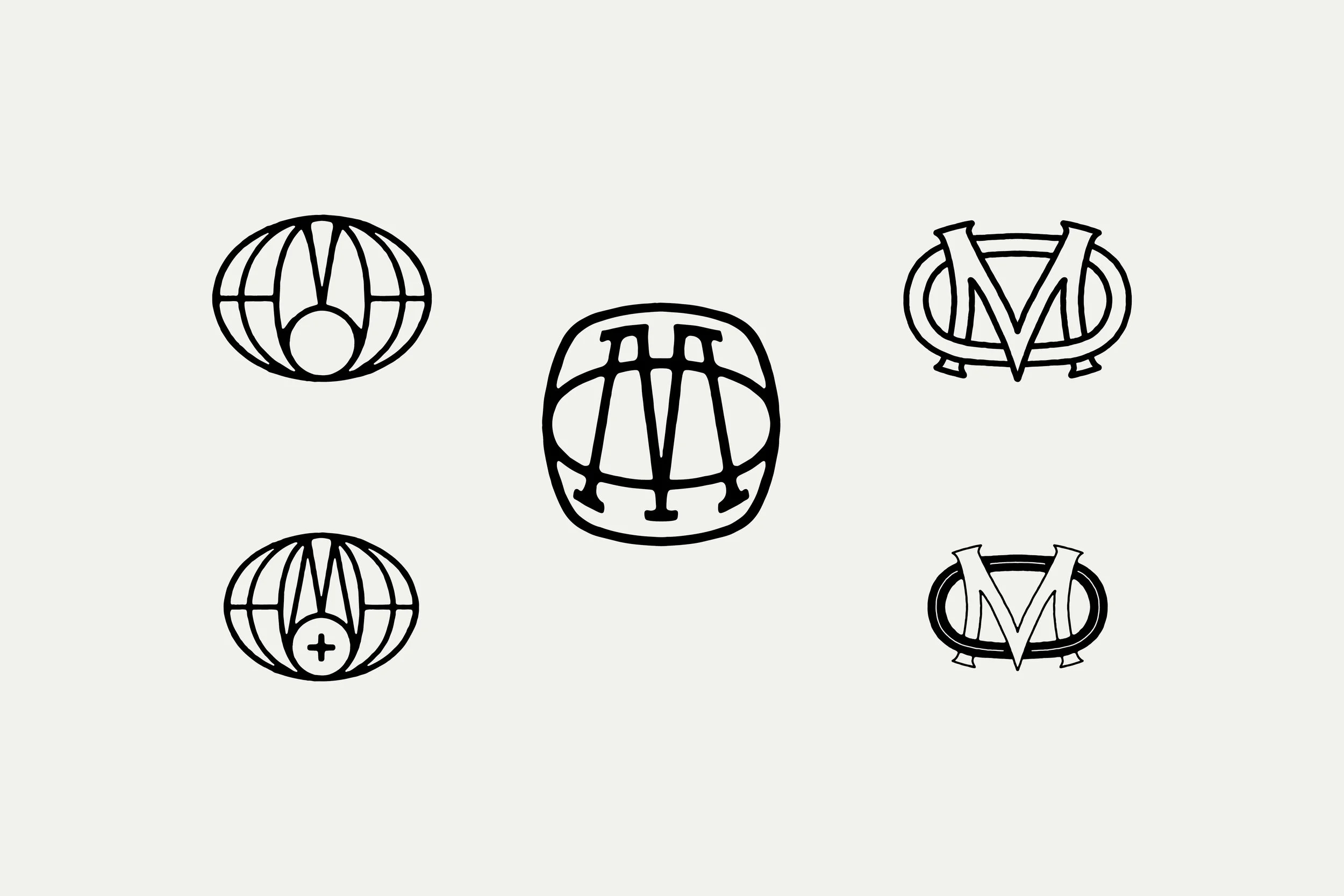
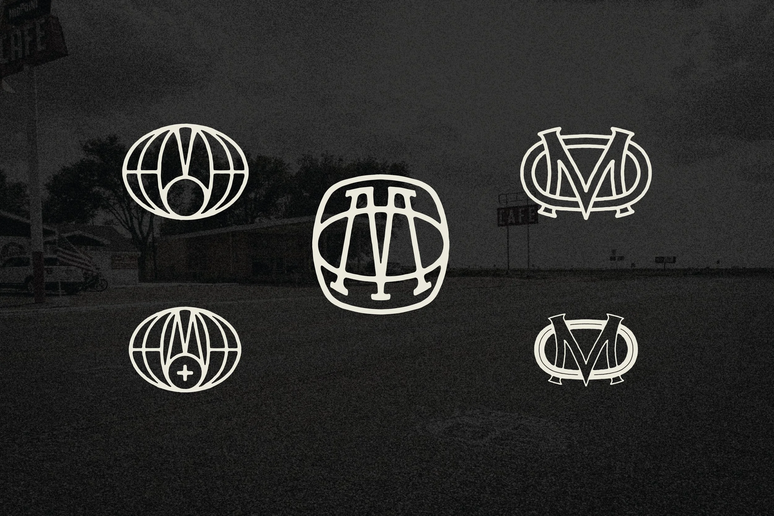
These initial concepts explore a visual identity that feels intentionally crafted and approachable, while still reflecting the cinematic quality of Max Otter’s work, using custom letterforms, and various monograms.
The goal was to avoid the overly polished or predictable language often seen in production branding. Instead, the directions lean into strong typography, and humanist details and a sense of character. Each concept is designed to feel intentional without becoming rigid, and distinctive without trying too hard.
Across the collection, the identity is meant to communicate a balance of creative instinct and dependable execution. It should feel like the work of a skilled maker: confident, collaborative and deeply invested in the final result.
These concepts are intended as a starting point for conversation. The strongest direction can then be refined into a cohesive brand system that feels authentic to Max Otter and flexible enough to scale alongside the work.